If your website isn’t converting, you could be missing out on a lot of business or wasting money on your marketing campaigns. To help you convert more customers, we’ve created a helpful guide on how local businesses can optimize their websites for conversions to make more sales.
What is Conversion Optimization?
Before we get too carried away, let’s go over the basics. A “conversion” is when someone takes a desired action or completes a goal on your website or landing page. That goal or desired action could be something like; filling out a contact form, making a purchase, subscribing to your email list, or even picking up the phone to make a call. Whatever the primary purpose for that particular page is will be the overall goal for a conversion.
Now, a conversion rate is the percentage of website visitors that actually complete that goal. For example, let’s say you spend $100 to direct 1,000 leads to your website and only 10 people buy something. In this case, 10 people out of 1000 visitors means that only 1% of the website visitors converted. That’s pitiful!
With conversion rate optimization, we make improvements to increase the total number of website visitors converting. For example, once we’ve conversion optimized our site, we want to be converting 200 people out of every 1000. That would give us a 20% conversion rate. That’s a considerable improvement and a lot more value for the $100 we spent advertising our website.
That improvement is the reason why we optimize for conversions. With Conversion Rate Optimization, we can lower our customer acquisition costs, generate more revenue with each customer, and above all else, improve your bottom line. So how do we optimize for conversions? Below is a list of the best practices for local business websites to improve conversion rates, grow your business, and improve your bottom line.
Aesthetics Matter, to a Point.
The aesthetics and overall look and feel of your website play a huge role when it comes to conversion optimization. Think of the visual cues you get while surfing the web. If you land on a sketchy looking website, you’ll think it was made by amateurs. If you land on a website that looks well made and professional, you will feel like you are working with someone more credible.
Look and Feel
What kind of visual cues signal trust to a potential customer? Things like having a strong sense of your brand, the colours on the site, imagery, and the overall design of the website can all have a significant impact on how trustworthy your brand feels.
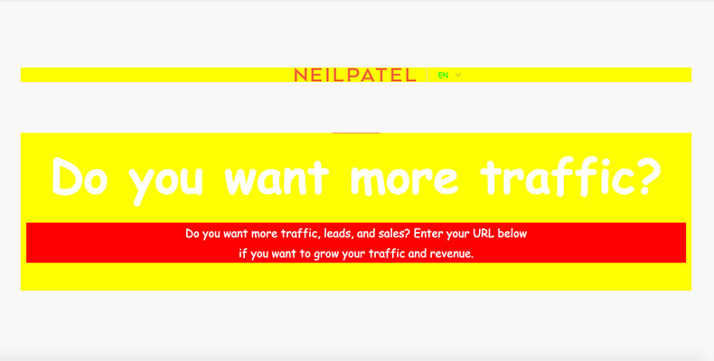
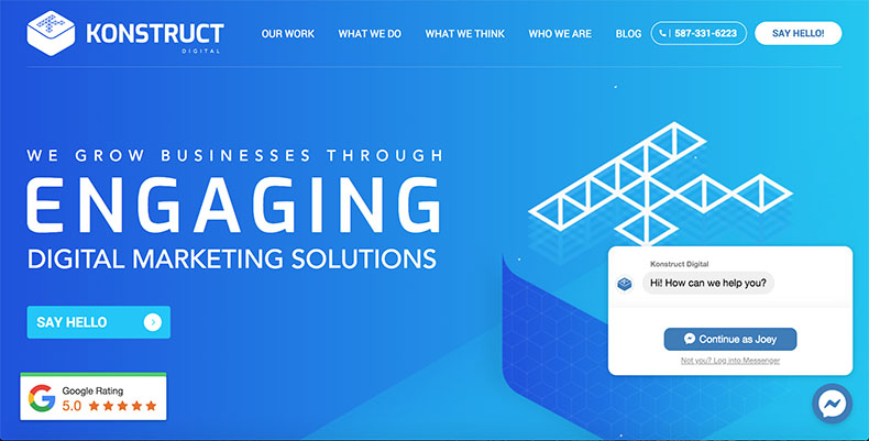
Which one of these marketing agencies would you want to hire?
To give this some context, think of something you regularly buy, like groceries. If the two stores sold groceries for the same price, one looked like someone’s garage, and the other one looked like a real grocery store, which one would you want to buy from? Even if the groceries are the same price, you’re going to want to buy those groceries from a legitimate grocery store because it looks like a more trustworthy source.
Choice of Colour
Now, what kind of impact does your choice of colour have on conversions? Colour can influence a lot more than you would think. Picking a good colour for your website has a lot more to do with conversions than just style.
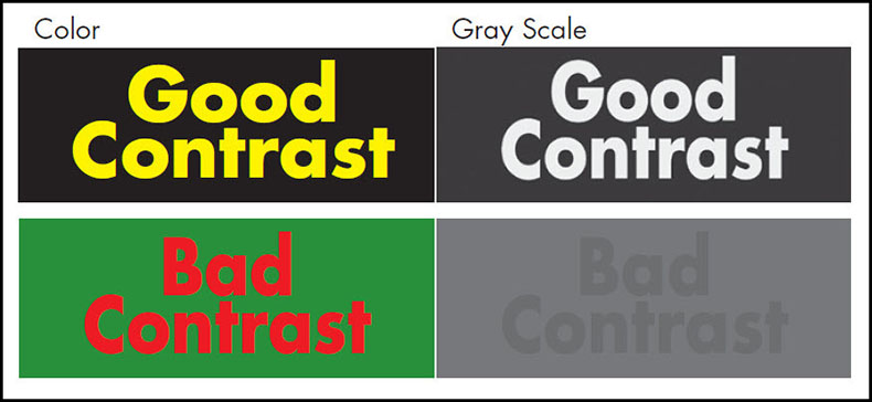
The contrast of your colour scheme plays a significant role in how people interact with your website and their ability to convert. If your text colour and the background colour of your website have a poor amount of contrast, it can make text extremely hard to read for the user. If your text is hard to read, it can give a tacky feel to a website. It’s also something that can frustrate users and make them want to leave.
Take a look at these examples:
Now, colour contrast can be used to draw attention to certain page elements like buttons and Calls-to-action (CTA’s). A popular way of doing this is using a contrasting colour like red or orange for primary links and a second slightly less contrasting colour like blue or green for secondary links. The colour cues signal a point of attention for the user, and the colour denotes their importance.
Design is Important, but Don’t Overinvest.
We’ve taken a look at what’s expected of a business and some of the general design principles behind good web design. However, how much should you invest and how much effort should go into designing your website? In this case, there is such a thing as too much.
To put things into perspective, your audience has an expectation of the minimum quality of what a website should look like. If your website dramatically exceeds the expectations of your audience, you may start to see some diminishing returns in terms of your conversion rate.
But why is that? Think of it this way. If you owned a plumbing company and you were looking to create an apple store-like experience, it would be pretty over the top for your business, and it would create some suspicion. If customers are looking for plumbing services, they likely aren’t looking for a high-tech experience. All of that money that you spent on designing a website like that wouldn’t have a very good return on investment.
At the end of the day, the design is important. But only to the point that it serves to generate more conversions. The most important metric to determine whether or not your website is doing its job is the number of conversions it is making and its conversion rate. Unless you’re a big brand with a massive budget, you don’t need a six-figure website to make your users convert.
Think Mobile
Studies show that 50% of all web traffic comes from mobile devices. Given that mobile users represent a sizeable segment of your overall web traffic, we need to ensure that your website is mobile friendly.
Even though on average, half of a businesses’ web traffic is coming from mobile devices, It’s shocking to see how many websites do not have a mobile-friendly design. Many websites are either not responsive or only marginally responsive on a mobile device.
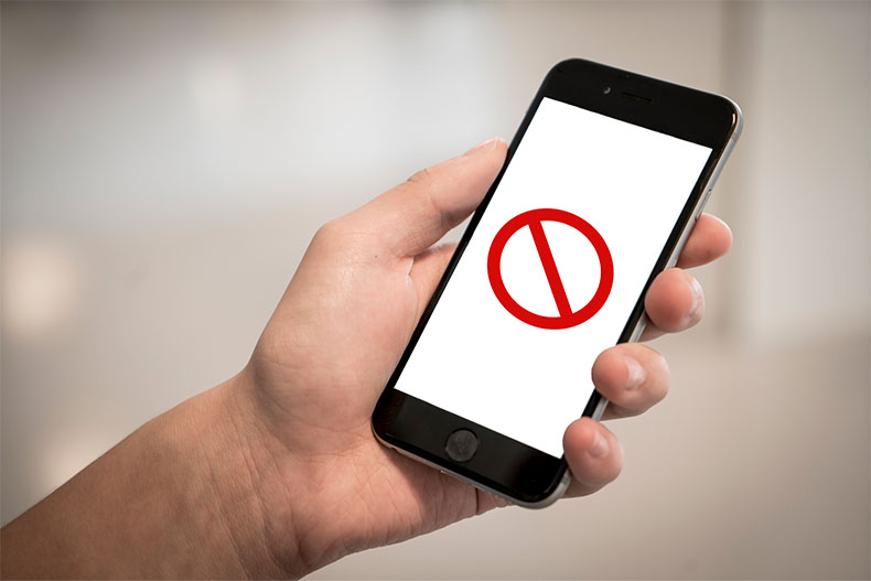
I think this website is broken…
Studies show that 80% of consumers do research from their mobile device. If you don’t have a website that works correctly on a mobile device, you will be losing out on a sizable amount of business if you are a B2C business.
Even more surprisingly, 80% of B2B businesses do research on more than one device. If a purchaser from a B2B business cannot get the needed information about your products and services, it’s going to be hard to make it onto their shortlist.
It may seem like common sense, but if your website hasn’t been optimized for mobile devices, you could be missing out on a substantial amount of business.
Think Beyond Responsive.
Now that you have an idea of how big of an impact mobile web traffic can have on your business, what can you do to optimize your website to generate more mobile conversions for your local business?
It’s important to have a website that is responsive on mobile devices, but we need to think about the overall mobile user experience (UX) from the very beginning when designing a website. Mobile users are just as important as desktop users when it comes to your funnel; they shouldn’t be treated as an afterthought.
Optimizing your website for conversions on mobile takes more than just mobile reactivity and aesthetics. Research shows that mobile users have a different set of expectations for website quality than their desktop counterparts.
Mobile users will not tolerate slow loading times. 53% of mobile website visits will be abandoned if a website takes more than 3 seconds to load. One out of two mobile users expect a page to load in two seconds or less. Finally, 46% of users say that waiting for pages to load is what they dislike the most when browsing the web on mobile devices.
That’s some pretty compelling evidence about mobile users. Your website doesn’t just need to look good on a mobile device; it also needs to be quick and functional to retain mobile users and not frustrate them. Load times play a significant role in the overall mobile user experience.
What’s Your Elevator Pitch?
If you’ve worked in sales in the past, you will know that it is critical to have your elevator speech dialed.
An elevator pitch is where you persuasively introduce your business to create some interest in thirty seconds or less. The idea is, you want to be able to convey enough information to drive some consideration from someone before they reach the next floor and lose interest (hence why it’s called an elevator pitch).
Website users should be treated similarly to someone you’re trying to pitch in an elevator. In this case, the hero statement (the first piece of text a user reads when landing on your website) is the elevator pitch.
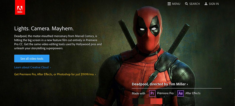
A strong hero statement about a real hero!
In the year 2000, the average human attention span was about twelve seconds. Thanks to the mobile revolution and the demand for immediate information, the average human attention span in this day and age is only eight seconds.
The main differentiating factor when pitching your business to website users is their shortened attention span. There are no closed doors to lock someone in and force them to listen to your pitch. Website users have a shorter attention span than goldfish, and they will exit your site.
Luckily, there is a way to combat this short attention span. We need to prioritize our hero statement in the “above the fold” section of our website. Think of what you see on the top half of a newspaper before pulling it out of a newspaper box. That area above the centerfold is the first thing you see along with the newspaper headline.
The same theory applies to websites. The above the fold section of the website is the first part of a website that a user sees when navigating to your website before they begin scrolling. In this case, your hero statement is going to be your website’s headline. This is going to grab a users attention and engage them.
Now, what makes a good hero statement? The same things that make a good newspaper headline. We need to answer the following questions with our hero statement:
- What do we do?
- Where do you do it? (i.e., which city or geographic area)
- How do you do it differently than your competitors?
- Why should the visitor care?
That may seem like a lot to answer, but we want to avoid a massive wall of text that will discourage our users from reading it all. We need to create a short, concise, but punchy statement that speaks to the value that we can deliver.
If you’re unable to sum all of that up in a single statement, a good option is to find a statement that speaks to most of your value proposition and use a subheader statement to provide more clarity. This statement should be less prominent than your hero statement so that it doesn’t take away from the impact that the hero statement has.
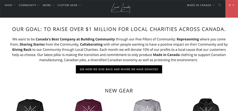
Local Laundry’s subheader statement.
Encourage Users to Take Action.
If you’ve ever had a conversation with a web or UX designer, you’ve probably heard many different acronyms thrown around about how they inspire people to take action and convert.
One of the most common terms you will hear is a “call-to-action.” A call-to-action is an element on your website that encourages users to take an action that will bring them closer to an end goal, or in other words, a conversion.
For local businesses looking to optimize for conversions, your call-to-action is going to be whatever action you want the user to take after visiting your website. For example:
- Book a Consultation
- Request an Estimate
- Book a Party
- Reserve a Vehicle
One of the best practices for conversion optimization and web design is to include your call-to-action alongside your hero statement. Pairing your call-to-action with your hero statement is a great way to provide a user with the needed value and quickly create a conversion. Additionally, we want to echo the call-to-action in intervals throughout the website after delivering more information and value to the user to encourage them to take the next step.
What Should the Call-to-action Look Like?
Having a call to action is a powerful way to entice users to take the next step towards a conversion. But how do we draw a users attention to a call-to-action to inspire them to take that next step?
Colour
Having a colour that stands out from the rest of your website or using a colour that users associate with a sense of urgency is an effective way to get more people to click your call-to-action and take the next step towards a conversion.
For example, studies show that using the colour orange on their call-to-action can increase a conversion rate by 32.5%. They also found that using the colour red, to give users a sense of urgency can improve a conversion rate by 21%.
Shapes
Shapes, icons and other features have also been proven to have a significant impact on conversion rates. Studies have shown that adding an arrow icon to a call to action can improve the number of clicks on that call to action by 26%.
Implementing these design principles with your call-to-actions has been proven to increase local business conversions by a substantial amount.
Connect Emotionally with Your Visitors.
Another critical element in the conversion optimization process for local businesses is creating an emotional connection with your customers.
There are many ways to create an emotional connection with your customers, but one of the most powerful ways is with the use of strong and meaningful imagery throughout your website – especially with your hero statement.
The intent of the imagery is to connect with your users and give them a sense of what your brand and business means to them. If you cannot create that kind of emotional connection, it can have a significant impact on your website conversions.
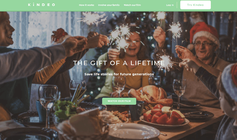
Research shows that despite our efforts not to be judgemental, we reflexively form first impressions almost immediately upon seeing people for the first time, especially faces. More importantly, there is a considerable agreement that these first impressions have a strong influence on our behaviour towards our interactions.
How to Leverage Emotions
Given that users are very likely to form a first impression before actually meeting anyone, it’s essential to utilize imagery that feels welcoming and speaks to the message and emotions you are trying to convey with your brand.
An excellent way to leverage some of the emotional cues is by using high-quality imagery of people. Whether it’s people that work for your business, management, or a spokesperson, we want to use the imagery to drive emotions and as a result of those emotions, influence the behaviors of users to entice them to convert.
An excellent way to go about this is to have some good quality photography taken. Hiring a photographer to capture your business locations and staff in their element can be invaluable to evoking emotions with your website. Good quality photography is also a great way to improve the look and feel of any marketing materials you may be trying to create as well.
If you don’t have any quality photography available for your website, stock photography makes a great alternative. There are tens of thousands of stock images available from different resources at a low cost that will fit the emotional message that you are trying to convey with your website.
There is one caveat you should be aware of if you decide to go the stock photography route. You’re going to need to avoid using stock photography that is obviously “fake.” People want to do business with real people, not stock photography models.

In some stock photos, it’s pretty easy to tell it’s a group of models and not real business people. If you see someone that you recognize from numerous other stock photos (like Vince Vaughn up there), you’re going to realize its fake and it will dilute the emotional connection you are trying to create.
Don’t Just Take Our Word for it.
Psychology and the Social Phenomenon.
There’s a psychological and social phenomenon that describes the way people mirror the actions of others in social situations. People will naturally mimic the actions and mannerisms of others to “fit in” and give themselves a sense of belonging.
If you’ve ever felt unsure about how to act in a social situation, you can probably relate to this. If someone displays a behaviour that you perceive as being correct, you will likely adapt and mimic their behaviour for a sense of reassurance.
Social Proof
As marketers, we’ve found ways to use this psychological phenomenon to influence our customers. When it comes to conversion optimization, we use something called “social proof” to give potential customers a sense of what it’s like to use our product or services and the perceived benefits to using them.
Social proof can take a few different forms. It generally consists of reviews, testimonials, case studies, or past projects to show potential customers what the real benefit of using our product or service is.
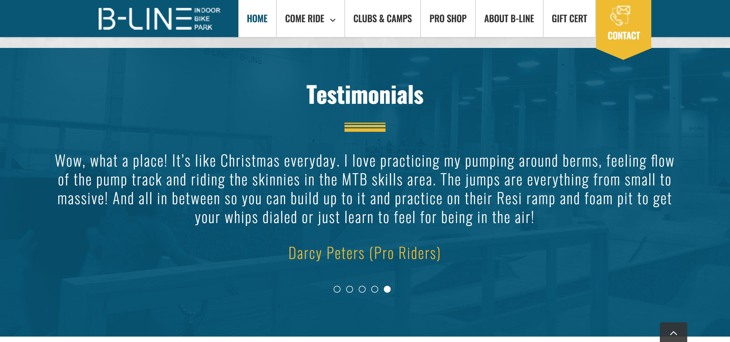
Think of it this way; if you were to see the benefit a product or service had created for a real person, you’d be more likely to think of what it could do for you. Take this testimonial from B-Line Bike Park for example. If you were an avid cyclist, you would be able to imagine the kind of benefits practicing in a safe environment would have on your riding skills.
Social proof is imperative when it comes to convincing people to take the next step towards a conversion. Having positive social proof can combat any anxieties that your customers may have and eliminate any hesitations or concerns they may have. The opposite is also true, having no social proof or even negative social proof can be a strong deterrent for customers, and they may take their business elsewhere.
To combat this, the implementation of a reputation management campaign can help offset the adverse effects of bad social proof. This usually consists of an ongoing campaign to encourage customers to leave reviews on established platforms like Google, Facebook, Yelp and others. We’ll give you more information about reputation management in a future article.
Luckily, the social proof that you include on your website is entirely in your control. It’s as easy as incorporating a handful of the best reviews and testimonials you’ve received from your customers in a prominent place within your website design.
Map the Buyer Journey.
Before we can make people convert, we need to create a map of what the buyer journey looks like so we can get a better understanding of what our customers experience on the path to a conversion. This is a critical part of the web design and conversion optimization process.

Beginning the Journey
Think critically about this. Where are they in our funnel on each page? On the home page, users are likely in the awareness stage. The home pages copy and content needs to be representative of the level of awareness and confidence a newer user would have for our brand.
When it comes to users navigating to our homepage; they likely understand that they have a need, they have googled it, and have clicked on the link to your business’ website. They know that they have a need, but nothing else.
Time is Ticking Away
As soon as they have clicked on the link to your website, the stopwatch begins! Remember when we told you people have a shorter attention span than goldfish? You’ve got eight seconds including the load time of your website to convince that person that your business is a good fit for their needs.
Once they’ve read the hero statement in that initial eight seconds and developed an initial impression of your business, users will hopefully be convinced that your business is a good match for their needs to either convert right away or read further.
Combat Anxieties
If a user continues to read your website, we need to anticipate and answer any questions they may have. This way we can deliver the information they may be looking for and confirm that we are a match for their needs.
Now that they have confirmed that our business is a good match for their needs, they may be unsure if we can deliver on the promises that we have made. This is where social proof comes in to combat any anxieties they may have. Seeing that we have delivered value for past customers will help alleviate any concerns they may have about our capabilities.
Conversion
After this, the customer should be ready to convert and will need to easily be able to find our call-to-action to take the next steps towards a conversion.
Another thing to keep in mind regarding the buyer journey and conversions is the theory behind Hick’s Law. Hick’s Law analyzes the time it takes for someone to make a decision based on the number of possible choices that they have. In this case, if a customer has many choices, it’s going to take longer for them to make a purchase decision.
In application, to optimize the number of conversions, we need to keep the number of choices minimal. If there are a number of choices, customers will either take longer to convert or have a harder time actually converting. Remember, the idea isn’t to educate the customer on every possible aspect of your business or industry; we only want to give them the information they need to convert.
Think of your buyer journey as a funnel that drives your overall conversion goal. Users start at the top with the awareness stage, and they move through the funnel on the path to a conversion. Once the customer has moved from the top awareness stage into your funnel, you don’t want to give them an opportunity to go back to the top of the funnel with an excessive number of choices.
TLDR Checklist:
There are a ton of other factors to consider when trying to optimize your business’ website for conversions but the content we have covered in this article should lay out the primary areas to focus on.
If you’re unsure if your current site has been optimized for conversions, we recommend through the checklist below. If you answer no to any of these questions, please reach out to us, and we will be happy to conduct a free website audit to help you optimize your website for conversions.
- Is the overall aesthetic of your website modern and attractive with colour and imagery that would inspire trust?
- Is the website equally navigable on both desktop and mobile?
- Including page load time, is a visitor able to understand what your business does and whether you are a fit for their needs without scrolling in 8 seconds or less?
- Are there clear call-to-actions present that will drive the visitor to your desired conversion goal?
- Does the above-the-fold imagery on your website offer emotional cues as to how you want the visitor to feel about your business?
- As the visitor continues reading, do subsequent sections anticipate further questions they may have?
- Does your homepage include social proof?
- Is your site navigation clear without overwhelming the visitor with decisions?
Need help with B2B Web Design?
Learn more about Konstruct's B2B Web Design Services
More B2B Web Design Resources
- Search Traffic Suicide: How B2B Companies Kill Their Lead Generation Engine
- 7 Must-Know B2B Website Metrics (and 4 Common Metrics That Don’t Actually Matter!)
- Use Heat Mapping to Build a Better User Experience
- Does My Site Need SSL?
- The Importance of Video on Websites
- “Not Secure” Message Coming to More HTTP sites in October
- Mobile First and Responsive Web Design
- What is AMP and How Can it Benefit Your Website?


