If you build it, they will come…
…But then what?
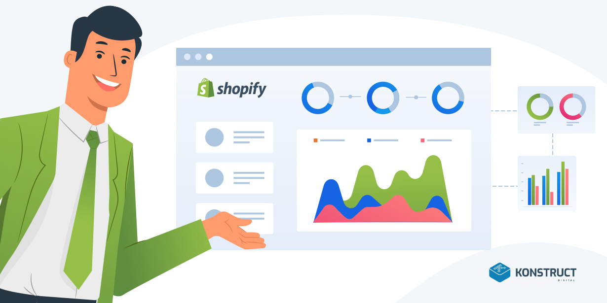
You have set up a storefront on Shopify, advertised it everywhere, optimized it for search using Konstruct’s handy Shopify SEO Guide, and people are finally coming to see your products online, yet the orders are not rolling in as often as you had hoped.
Turns out, just building a storefront for your products doesn’t guarantee an onslaught of orders. Online shoppers are known to be notoriously fickle. Most times, the stars must align for a casual website visitor to become a buyer of your products.
Similarly, any little inconvenience can push even the most motivated buyer over the edge and make them leave the site forever, never to return.
Luckily, there are some easy Shopify store optimization steps you can take that will result in immediate improvements to your conversion rate and will increase Shopify sales for your store.
What is a Conversion?

Let’s start with the basics. A conversion is an action your website visitor performs that brings value to your business. There are 2 types of conversions: Macro and micro.
Macro conversions on a website are whenever a visitor completes the primary objective of your site – for eCommerce stores, that’s usually a completed purchase. Some other examples are: sign up for your loyalty program or an inquiry about a specific product. If you can put a dollar value to the action, it is likely a macro conversion.
Micro conversions are whenever a visitor engages with your site content, and are important steps along the path of making a macro conversion. Examples include: watching a product video, reading product reviews, or signing up for a newsletter.
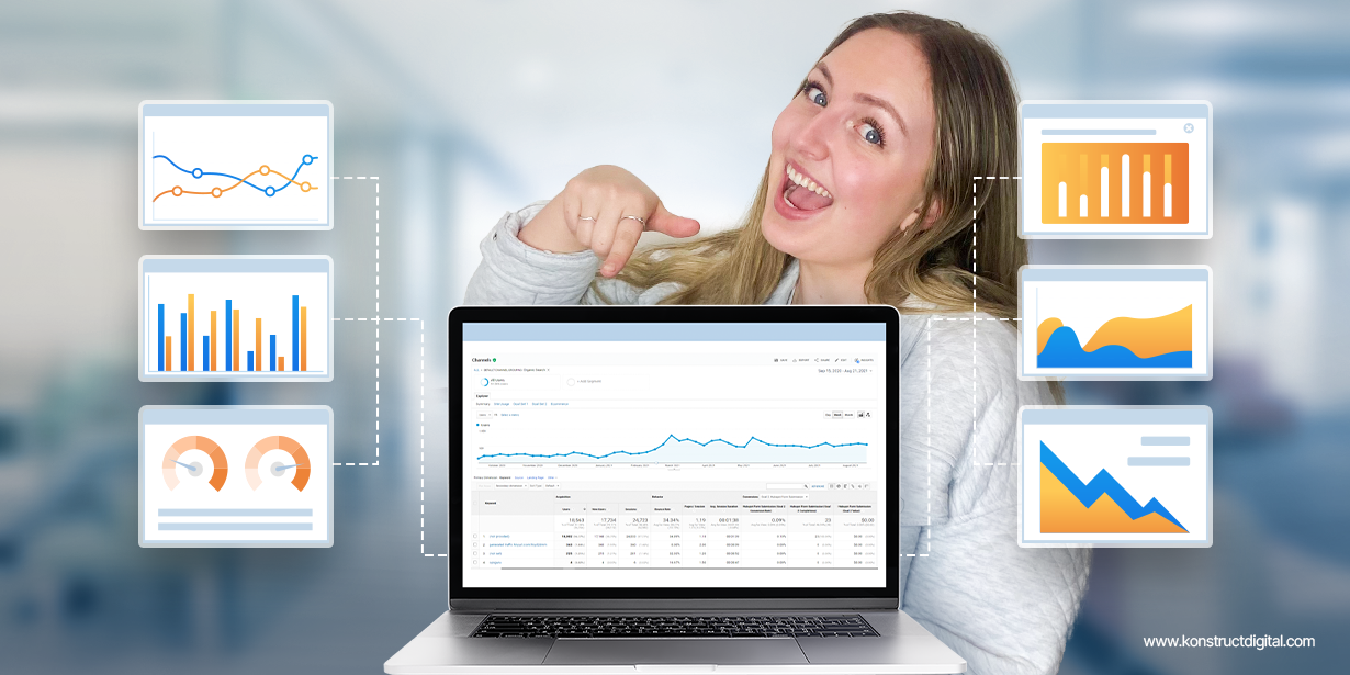
Conversion rate optimization (CRO) is a set of actions you take to improve your website’s overall functionality and appearance and its ability to bring in micro and macro conversions.
Let’s go through Shopify conversion tips in each area of your store.
Build Trust

To ensure your website visitors feel comfortable and confident to complete a purchase or a micro conversion on your site, you will need to win their trust. A key part of Shopify CRO is to make sure that every element of the website focuses on reassuring the visitor that your brand is safe, transparent, and trustworthy.
Customer Service Integration on All Pages
Online shoppers have high customer service expectations. If they have questions regarding your products, shipping, or returns, they expect answers and they expect them NOW. Giving your customers the ability to contact you easily and quickly, no matter where they are on your site will increase the chances of a sale.
How: On Shopify, you can add live chat by integrating one of many paid or free apps. We also recommend adding your phone number to the header of the website.
Generous Return Policy
We all have seen stories and pictures of people having ordered something online and receiving something completely different in the mail. Naturally, online shoppers are wary of impulse buying stuff they have not seen in real life, touched, or tried on.
Offering a generous and simple return policy actively promoted on your homepage and the product pages will eliminate or at least decrease the uncertainty.
How: A “generous” return usually means free returns, a long trial period, paid return shipping, or similar. You can advertise your return policy in a special area on the homepage, add it to the product description, the checkout, or even add a floating header using Shopify apps.
Trust Seals
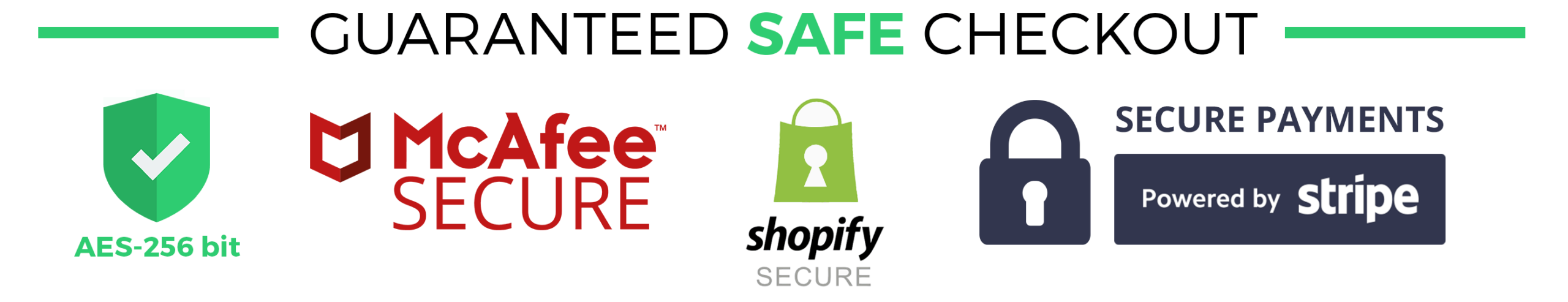
These days, online customers are less hesitant about simply entering their credit card information on a site and worry less about getting scammed or their credit card information ending up in the wrong hands. However, it never hurts to reassure your website visitors and buyers of the secure checkout options you have available on your site. Also, don’t be shy about flaunting that 24/7 customer support badge or your money-back guarantee. These trust seals will win your visitors over and make it easy for them to commit to a purchase on your site.
How: We recommend adding your trust seals in the areas of the website that get a lot of traffic, including your header and footer.
Reviews

Reviews are similar to votes cast in favour of your brand by other online shoppers. They help erase any doubts and answer potential customers’ questions about your brand and your products. To increase the chances of conversions, make sure to feature reviews on your website.
Overall Site Reviews
We are all influenced by the opinions of others. When shopping online, seeing reviews from your previous customers is certainly reassuring. Site reviews include Google Trusted Stores, Bizrate, Shopper Approved and others that are not product-specific.
How: There are many apps available on Shopify that let you add reviews to your site. Check out our independent review of the top Shopify marketing apps on the market.
Product Reviews
Aside from knowing that your site and your brand overall are reputable, your potential buyers need to know that the products they are looking to purchase have been bought and enjoyed by other people in the past.
How: Add product-specific reviews to your homepage and product pages to instil trust and confidence in your potential buyer.
Reviews From Other Sites
Having brand and product reviews on your site from past clients is a great start, but some more suspicious clients may argue that those reviews could be fake or purchased. This is why displaying third-party independent reviews from Amazon, Google, TripAdvisor, or one of many other reputable platforms is a great way to convert any skeptic visitor into a loyal customer.
Customer Support

Online stores can appear lifeless. Without store clerks, shopping assistants, checkout staff, shoppers are left to fend for themselves. Offer an open line of communication and your customers will feel supported and cared for – which can help increase Shopify sales.
Live Chat
Unless you want your website visitors and potential customers to feel like they are ignored, they should easily be able to get a hold of your business to get the answers they need during normal business hours. According to studies, 44% of online shoppers prefer live chat over other customer service channels.
How: Use a Shopify app to add live chat to your store. If you need inspiration, check out our roundup of the best Shopify apps.
Customer Service Contact Details
If a customer has a question outside of business hours or doesn’t wish to ask the question via live chat, they should be able to easily find your contact details.
How: Add contact details in either in the header or the footer of the site. Your contact details can also be stored in a “Contact Us” page, but both your header and footer should link to the page with contact information.
Direct Phone Number
For online shoppers, it’s all about the convenience. At times, making a purchase on a website is only one question and answer away. If a shopper is browsing your store on mobile, being able to click on the phone button to call the business directly and ask that one question will certainly improve your conversion rate.
How: Add click-to-call schema to the phone numbers on your site.
Q&A
Adding a Q&A section to your product pages is a great solution to help your clients get the answers they need, quickly. This will save you time so you or your customer support won’t have to answer the same questions over and over again.
Shipping/Returns

Shipping and returns are an important aspect of online shopping. Make both experiences delightful and guarantee yourself a satisfied customer who will return to buy again and again.
Free Shipping
If you need proof that free shipping will improve your conversion rate, simply do a quick search on “Free Shipping Conversion Rate” and you’ll find plenty of case studies of various eCommerce businesses doubling and tripling their revenue thanks to this simple technique.
How: Whether you have to roll the shipping cost into the total price of your product, offer free shipping on specific minimum purchase orders, or offer it to subscribers or return customers, it is absolutely worth it to offer free shipping on your website.
Free Returns
Most of us have made a hasty purchase decision and regretted it afterward. Offering free returns on products acts as a psychological safety net, reassuring your customers that if the purchasing decision they made was wrong, they have the ability to correct it without any losses.
How: If you offer free shipping, make sure to advertise prominently on your site.
Global Site Elements

We are talking about elements that can be found throughout the entire site. These elements are a high priority for your Shopify CRO, and it is extremely important to hit them out of the park. Make improvements to all of them, and your conversion rate will blow you away!
Responsive Site
According to this article, Mobile eCommerce sales account for 34.5% of total eCommerce sales in 2017, and that number is expected to grow to 54% by 2021. With that, you can be sure that your customers are expecting your website to be responsive, so the layout and the page elements to adjust to their screen size. If they can’t easily browse or complete a purchase because your website looks or functions wonky on a mobile device, you can say goodbye to that visitor forever.
Optimal Site Speed
Site speed is everything. It affects user experience and acts as a large contributor to the website’s rankings. Generally speaking, websites created on the Shopify platform are blessed by a great site speed score, but there are always additional improvements that can be made.
How: Check out our tips on how to improve site speed.
What’s In It For Me?
With hundreds of thousands of eCommerce websites out there, something has to set your website apart from the others. Marketers call that Unique Selling Proposition (USP). Your USP should be concise, clear, speak directly to your customers’ needs, address their objections, and offer immediate value.
How: To come up with the perfect USP, you should answer your customer’s question – “What’s in it for me?”. Once you have a solid USP, put it front and center on your site!
Sticky Menu/Header
Many eCommerce websites look and act as catalogues, full of pages and pages of products. Constantly having to scroll up to the main navigation or menu when browsing a website with large inventory can become quite tiring and cumbersome.
How: We recommend making your header or the main elements of your website navigation “sticky”, so it will follow your website user as they scroll through the homepage, catalogue, and product pages.
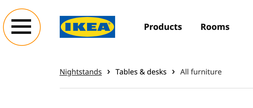
Hamburger Menu for Mobile
Mobile screens offer less space, so you need to use it wisely.
How: Instead of having a full header menu that takes up a large portion of the screen, use a collapsible hamburger menu (see example below).
Fail to the Footer
Our behaviour on websites is driven by conventions. For example, when we click the home button or the brand’s logo, we subconsciously expect to end up on the homepage of the website. Why? Because this expectation was engraved in us by dozens of websites that used those conventional elements and placements. Conventionally, if a website visitor is unable to find the page or information they are looking for, they will look in the footer of the site.
How: Make sure all links to all categories and sub-categories, as well as customer service phone number/links, general contact info, shipping/returns policy, etc are all neatly located in your footer.
Entry Offer
Both micro and macro conversions can be achieved by adding an entry offer to your website. Nothing says “we care about you, and we want your business” better than a 20% off on the first purchase in exchange for an email address. Few people can resist turning down a deal, and many will submit their email address in exchange for a promo code for the special offer. Even if they don’t end up making a purchase on their initial visit, you can continue marketing special offers to them via email.
How: Popup offers can be timed to trigger when a user first enters a site or has scrolled to a certain part of the site. There are many Shopify apps available out there that will help you set up your very own entry offer.
Exit Offer
There is nothing more disappointing to an eCommerce business owner than a missed opportunity to convert a visitor. Once they leave your website, it becomes extremely difficult to bring them back. Having a direct communication line with the website visitor is the ultimate goal and can potentially be attained when the visitor attempts to leave your site.
How: Use an app to create an exit offer popup that will trigger when the user tries to navigate away from your website or close the browser window. Offer a coupon, a promo code, a free download or a sample in exchange for the user’s email address and improve your chances of bringing the user back to the site to complete a purchase.
Global Promo Area
If you are running promotions of sales on your site to improve the conversion rate, you need to ensure the visitor is constantly reminded of the deal while they are browsing various products and pages.
How: Include a global promotions area that is visible on the homepage and the product pages. The best place for the promotions is usually right under the header menu. To boost visibility even more, you can make the promotion area sticky, so it will follow the user as they browse the site.
Search Functionality
A search function is extremely important on eCommerce websites, particularly ones with a large inventory.
How: Make sure your search function is readily available in the header of the website. For mobile, the best option is to include an eyeglass icon that opens a search function.
Sale/Clearance Area
Everyone loves a sale! Most of us will look for an offer or a sale when we first enter an eCommerce website.
How: If your products ever go on sale, it’s a good idea to add a button to your header navigation or a special category dedicated to sales and clearance items. You will be surprised by the amount of traffic that the page will see on a regular basis.
Homepage

Your homepage is often the place where your visitors will begin their shopping journey. Make sure it’s a welcoming, organized place where customers will feel comfortable and confident to get shopping and complete conversions!
Categories
To ensure your visitors are not overwhelmed by the variety or the number of products, or lack of organization when they arrive at your website’s homepage, you need to break up your products into categories. Navigating a website and browsing products becomes much easier if categories are present.
How: Feature categories on the homepage outside of the footer and header, so your visitors will know from the start the types of products they can find on your site.
Direct Path to Products
To make it easy for the visitor to go straight to shopping, the homepage should be providing gateways to various categories of products offered on your site.
How: To get an indecisive and uncertain visitor going, and diving straight into the shopping experience, we recommend featuring a few popular products or bestsellers on your homepage outside of the categories.
Product Pages
Product pages are individual pages dedicated to your products. A visitor who clicks on a product page is likely motivated to make a purchase, so make sure the product page has all the information your visitors need to covert.
Multiple Product Images
Shopping online has its drawbacks: you can’t touch the product, feel it, or see it in scale. Not having multiple images of your products from various angles makes it difficult for the customer to get a sense of your product, bringing the chance of conversion close to zero.
How: Take the time and add high-quality images to your product pages to get your visitors excited about your products.
Inventory Flags
What could be more frustrating than falling in love with a product on an eCommerce site, only to find out that it is sold out?
How: Adding an out of stock flag to your products will spare your visitors from experiencing frustration. Adding a low inventory flag will light a scarcity fire under your visitor and encourage a faster conversion.
Sticky Add to Cart CTA
The “Add to Cart” button is basically the golden ticket of a macro conversion! The best way to ensure your website visitor clicks the coveted button is to make it impossible to miss.
How: Making the Add to Cart button “sticky”. The button should follow the user as they scroll through the product page so they would never have to look for it.
Proper Sale Price Indication
When it comes to sale items and pricing, there should never be ambiguity. You have to be very explicit in communicating the sale price or discount on an item.
How: Add a cross-out of the previous price, add a “Final sale” indicator, or add a price drop discount value. No matter what, the final price should always be visible on the product page.
Cross-Selling
Cross-selling is upselling by suggesting products or services that are related or complements the product your customer is interested in.
This technique is essentially the eCommerce equivalent to the grocery store candy rack! Cross-selling is a proven and tested technique and it will without a doubt improve your conversion rate and boost your bottom line.
How: There are dozens of ways you can cross-promote other products and grow your revenue, such as “Customers who have purchased this product also purchased these products”, “Bundle offer”, “You may also like…”, “Recommended for you…”, “Add these for and get 10% off”, “Buy two more and get the fourth one free”.
Wishlist/Favourites
Wishlist and Favourites can be compared to window shopping. Whether a visitor is unable or unwilling to make an immediate purchase, they should be able to save items to return to them at a later date.
How: Allow your visitors to save their favourites. As an added bonus, you also open up an opportunity to market to them via email in the future and remind them of these products.
Social Media CTA
Studies show that 29% of consumers follow a brand on Twitter. 58% of Facebook users have liked a brand. 42% have mentioned a brand in their status update on Facebook. To become one of those brands consumers are talking about, you need to give your visitors an opportunity to complete a micro conversion – to follow or like your social media accounts.
How: Place a call to action to check out and follow your accounts front and center on your homepage, your footer, and even your product pages.
Cart
The Cart is the second last stop before you can ring the sale bell. The experience your visitor has with the shopping cart has to be smooth and seamless, but most importantly, it needs to be transparent to ensure the visitor is not turned off of completing the conversion.
Final Price Display
Transparency is the key factor in the cart experience. Not knowing what the final cost of the purchase will be is one of the leading causes of cart abandonment.
How: Make sure your customer is able to see the final cost of the products they added to the cart or at least a very close estimate.
Shipping and Handling Listed
Shipping and handling costs are another leading reason for cart abandonment. Many sites will only bring up the shipping cost at the checkout step, and if the cost is unexpectedly high, it will cause an exponentially worse user experience and leave a bad impression on the visitor overall.
How: Include the shipping and handling costs, or at least estimates in the cart.
Product Images in the Cart
Sometimes hours and dozens of products can pass on the way to the shopping cart. Many visitors won’t recall all the items they placed in the cart. Having to decipher product codes and names to understand the items in the cart is extremely frustrating, but can be easily avoided.
How: Add relevant product images that will help users identify each item.
No-Expiry Cart
Imagine you spent the last hour picking out your new cellphone case. You finally add it to the cart, but then you accidentally close the browser tab. You quickly open the site again, only to find out that the cart is empty and you need to start over. There’s a higher chance of completing a purchase if your visitor returns to the site to find their phone case patiently waiting for you in the cart.
How: To make sure your customers can always return to where they left off, set your cart to never expire.
Checkout

The checkout: the Holy Grail of conversions. Only a few clicks and you can ring the bell to announce another sale! Let’s first make sure that the checkout experience is indeed only a few clicks and is as smooth as it can possibly be.
Guest Checkout
Online shopping can be truly exhausting. All the browsing, comparing, careful reading of every product detail… By the time you reach the checkout, all you want to do is get it done and over with.
How: Allow your customers to checkout as guests, without having to create an account, set up a password, confirm their email or any other unnecessary steps. It is also a good idea to offer an optional account creation for those loyal customers who will come back to purchase again.
Express Checkout
Reward your loyal customers who shop on your site regularly and have created an account.
How: Offer express check out. Once logged in, all customer information should be auto-populated and all the customers will only be responsible for verifying and confirming the details.
Auto-Suggest for Address
Auto-suggest for addresses is a very nifty optional feature of the checkout. This feature saves the customer a ton of time and typing, getting them closer to the “Place order” button.
How: Implementing an auto-suggest for shipping and billing address. It automatically pulls address details previously saved by the browser and auto-fills the selected option in each address field.
Shipping & Billing
More often than not, the shipping and billing address are the same, so why not offer the opportunity for your customer to save some time?
How: Offer the option for the customer to select “Same” for shipping and billing information, so they will automatically duplicate one another.
Let’s get to work!
Now that you’ve read about these Shopify conversion hacks, it’s time to implement them on your storefront. Some of them will be very easy and won’t cost you a dime, others will take more time and effort.
One thing is for certain – implementing these Shopify optimization techniques, tools and solutions on your eCommerce site will improve your conversions, user experience, and brand loyalty.
We have tested these techniques on our client’s sites and each and every one of them saw an increase in revenue and micro and macro conversions. If you’re looking to boost your Shopify sales, learn more about our Shopify marketing services.